Garvin’s Logo

The original and current logo
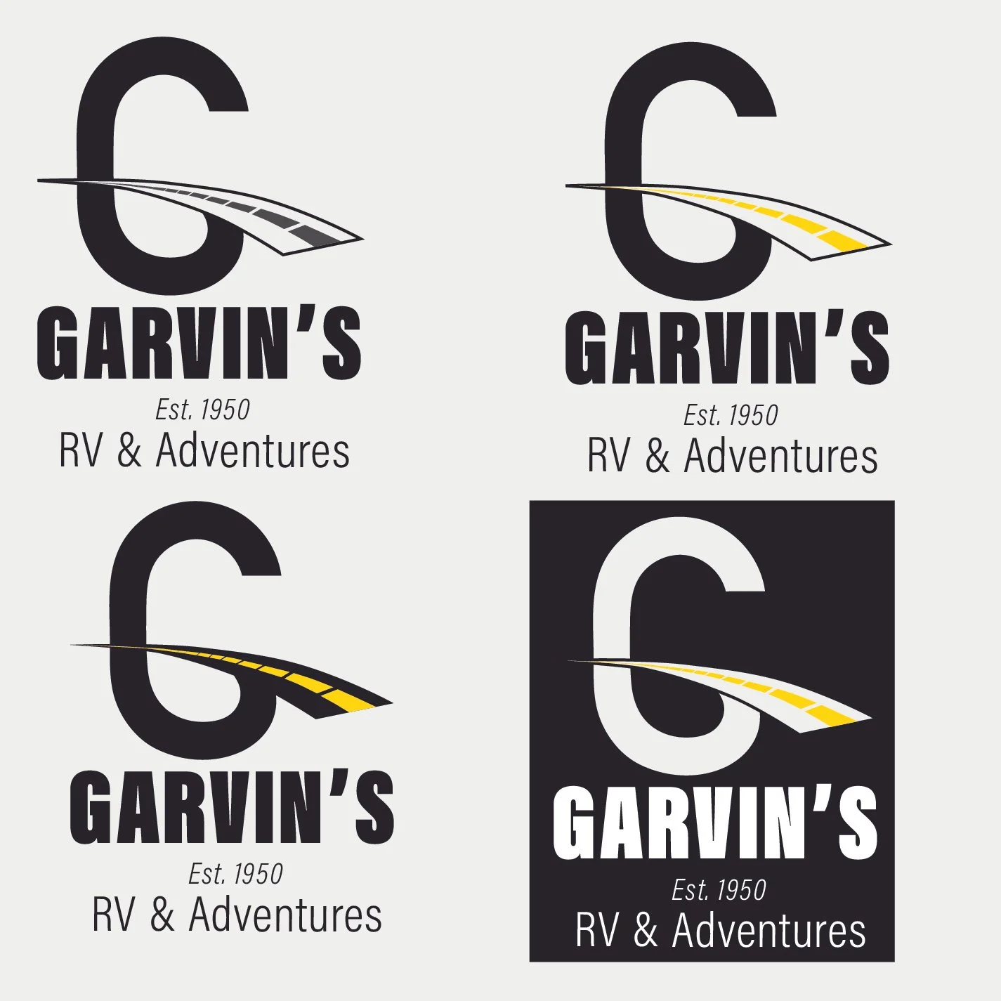
Image above: After redesign results

The goal of this project was to choose a "bad" logo of our liking and redesign it. I decided to select a family-owned business passed down to family members since 1950. The first store opened in Tempe, AZ, and later relocated to Payson, AZ. This company sells RVs, rents RVs to customers, provides RV services, and much more.
My design process began by selecting a typeface that would be easily readable for everyone. Then, I considered the current logo style seen in major companies, which is modern.
To align this logo with the company, I added a street strip on the letter “G” to symbolize the RVs used on roads for long trips with family or friends. In addition to this project, I needed to create a mockup graphic manual. In the manual, you will find many details, such as the typography used in the logo, examples of logo placements, which color schemes not to use, recommended background colors for the logo, and instructions not to modify the logo.
***Clicking the image will open the PDF file that will provide the full manual***